10 Red Flags to Watch for When Choosing a Publishing Company
10 Red Flags to Watch for When Choosing a Publishing Company Choosing a publishing company is a big…
Read article
A great cover does a specific job in a fraction of a second. Here is what separates covers that convert from covers that get scrolled past.


Readers judge a book before they read a single sentence.
They see the cover first, often for only a few seconds, and decide whether the book looks interesting, trustworthy, and relevant to them.
A strong cover cannot guarantee sales. A weak one makes an excellent book easy to ignore.
A good cover does more than look nice. It signals genre, tone, quality, and audience at a glance, and helps the right reader think, “This might be for me.”
The best covers are not built on personal taste. They are built on clear positioning, readable type, strong hierarchy, and an understanding of how books get discovered.
Here is what goes into a cover that earns attention and supports sales.
The first job of a cover is to tell readers what kind of book they are holding.
Readers build expectations from the covers they see across a genre.
A thriller leans on dark tones, sharp contrast, and unsettling imagery. A romance uses intimate artwork, softer colors, and expressive type. A business book relies on bold text and a confident, structured layout.
These patterns are not accidents. They are signals.
A reader should not have to study a cover to know if it is fantasy, memoir, or self-help. If the genre is unclear, the book attracts the wrong audience or none at all.
This does not mean copying other covers. The goal is familiarity with a twist: right for the market, but distinct enough to stand apart.
Before you design, study the bestsellers in your category. Look for repeated choices in color, imagery, type, and composition. Those patterns are what readers already associate with the genre.
A cover needs one element that grabs the eye first.
It might be the title, a character, an object, a symbol, or a striking image. Without a focal point, the eye does not know where to land.
Weak covers cram in too much: several characters, a busy background, badges, subtitles, and clashing fonts. The result feels crowded instead of interesting.
A strong focal point creates instant clarity.
A memoir might center on one meaningful photo. A fantasy novel might use a single symbol like a crown or a sword. A nonfiction book might make the title itself the star.
The focal point should hint at the book’s central idea without explaining the whole story.
A cover is not a plot summary. It is an invitation.
A beautiful title is useless if readers cannot read it.
Type is one of the most important parts of a cover, because the title carries the main message.
It has to stay clear at full size, as a tiny thumbnail, and on any screen.
Covers show up in search results, feeds, ads, and storefronts, often at a small size. Thin lettering, low contrast, and fussy fonts vanish when the cover shrinks.
Give the title strong contrast against the background. Make it large enough to read without swallowing the whole design.
Match the font to the genre. Bold condensed type for suspense. A restrained serif for literary fiction. Playful lettering for children’s books. Clean modern type for professional nonfiction.
Stick to one or two well-matched typefaces. Piling on unrelated fonts makes a cover look unplanned.
Readability comes before decoration.
Hierarchy controls the order in which readers notice things.
Usually the title gets the most weight. Subtitle, author name, and series details follow in a clear sequence.
A reader should grasp the cover fast:
You build hierarchy through size, placement, spacing, contrast, and color.
Make everything big and bold and nothing feels important. If the title, subtitle, and author name all shout at once, the cover is hard to read.
The order can shift. A famous author’s name may lead, because the name sells the book. For a new author, the title and concept take the spotlight.
Every element should earn its size and position.
Color shapes a reader’s feeling before they process the design.
Dark blues, blacks, and greys suggest mystery, authority, or tension. Warm reds, oranges, and yellows signal energy, passion, or urgency. Soft pastels feel gentle, romantic, or right for younger readers.
The palette follows genre, audience, and subject.
Color should match the book’s promise. A cheerful children’s story feels wrong in a cold, severe palette. A serious finance guide loses credibility if it looks playful.
Contrast matters too. Text must stay readable, and key elements should not blur together.
A limited palette usually looks more professional than a scatter of colors. Two or three main colors plus neutrals create impact and consistency.
Color should be a choice, not decoration added to look exciting.

Images should say something real about the book.
Stock photos, illustration, collage, abstract art, and type-led covers can all work when they fit the concept. The medium is not the problem. Generic or disconnected visuals are.
A cover image does not need to show every character or event. It should capture the central mood, conflict, or promise.
For fiction, imagery hints at the story world or the emotional stakes. For nonfiction, it points to a transformation, a problem, or a result.
The image should feel original enough to stand out. Overused stock photos and predictable symbols make a book look interchangeable.
Good editing rescues familiar imagery. Cropping, lighting, texture, and color treatment change how an image feels.
The image and text should work as one design, not two pieces sharing a background.
Good covers use less than most authors expect.
White space gives the title and image room to breathe. It improves readability and looks more confident.
A crowded cover reads as amateur, even when each piece is attractive. Too many graphics, frames, shadows, and labels weaken the message.
Simple does not mean plain. It means only what the cover needs.
The goal is not to remove personality. It is to remove distraction.
Here is the test that catches most problems: shrink the cover to a thumbnail.
Many book-buying decisions start on a screen, at a size smaller than a stamp.
At thumbnail size, ask:
Fine details disappear. Thin text breaks up. Busy backgrounds turn to clutter.
Check the cover at full size, thumbnail size, and in grayscale. Each view reveals weaknesses the others hide.
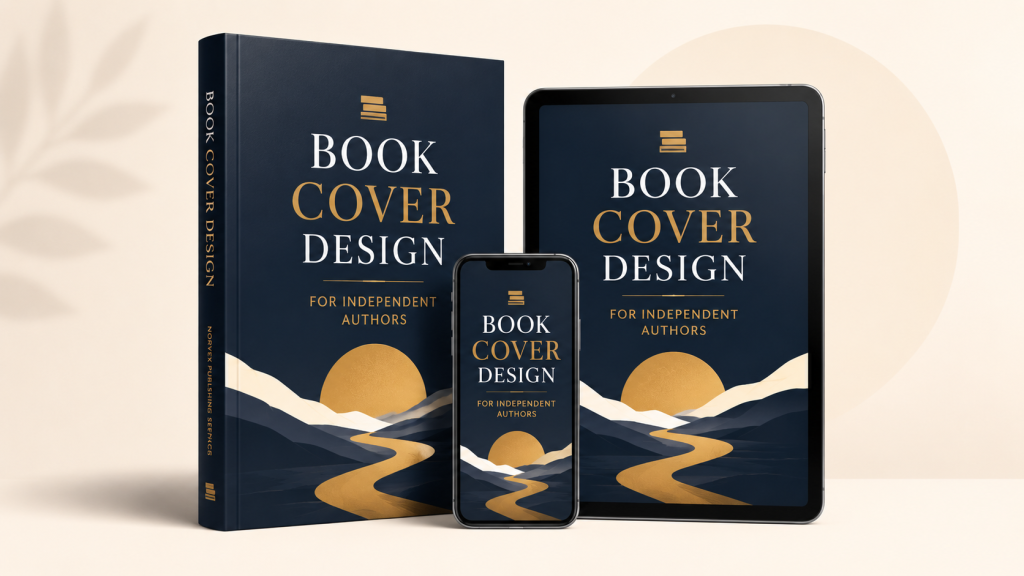
Readers cannot always explain why a cover looks professional, but they know when it does not.
Professional quality comes from small decisions:
Prepare the cover for its format. Ebook covers are front-only. Print covers need a full wrap with back cover and spine.
Spine width depends on page count, paper type, and printer specs. Barcode, trim, bleed, and safe zones all have to be right.
Get this wrong and text gets cut off, white borders appear, or the upload gets rejected.
A strong concept still needs accurate production.
For print, the back cover turns interest into a decision.
Once the front pulls a reader in, they flip the book over. The back should tell them what the book offers and why to keep going.
It can include:
Do not overload it. Long paragraphs in tiny type push readers away.
Focus the description on value. For fiction, build tension without spoilers. For nonfiction, name the problem, the benefit, and the outcome.
The back should feel like the front’s twin, not an afterthought.
A cover succeeds when it appeals to its intended reader, not to everyone.
Authors often pick a design from personal taste: a favorite color, font, or image that means something to them. That connection matters, but the cover has a commercial job too.
The design should reflect what the target reader expects.
A book for senior executives should not look like one for new graduates. A middle-grade fantasy should not look like an adult epic. A cozy mystery should not look like a violent thriller.
Think about the reader’s age, interests, habits, and where they buy books. The cover should feel like it belongs in their world.
The best design sparks instant recognition: “This looks like the kind of book I enjoy.”
A cover has to stand out without becoming unreadable.
This is the hardest balance in cover design.
Look too much like every competitor and the book disappears. Reject every convention and readers cannot tell what it is.
The winning move is usually a familiar structure with one distinctive idea.
Use recognizable genre type but an unexpected central image. Follow a common color pattern but a bolder composition. Take a simple concept and execute it with more restraint and detail.
Originality should make a book easier to recognize, not harder to classify.
Review the cover before it is final.
Compare a few concepts, test them at thumbnail size, and gather feedback from people who know the market.
Choose your reviewers well. Friends and family offer encouragement, not market insight. Readers, booksellers, designers, and editors give sharper answers.
Ask specific questions:
These beat “Do you like it?” every time.
The point of testing is not to please everyone. It is to confirm the cover sends the right message.
A cover is not decoration added at the end. It is a core part of the book’s positioning.
It shapes how the book looks in listings, ads, reviews, social posts, and store displays. A strong cover ties the manuscript, market, description, and audience together and makes the book easy to remember.
A cover that sells usually has these working at once:
No single feature carries the design. It works when every part points to the same message.
A cover has only a few seconds to earn attention. The best ones are not the most complex or artistic. They make the book’s genre, tone, and value clear at once.
Before you approve a design, look past whether it is pretty. Ask whether it reaches the right reader, holds up at thumbnail size, fits the market, and delivers on the book’s promise.
When those line up, the cover stops being packaging. It becomes one of the book’s strongest marketing tools.

Part of the team at Norvex Publishing Services, writing about the craft and business of publishing.
10 Red Flags to Watch for When Choosing a Publishing Company Choosing a publishing company is a big…
Read article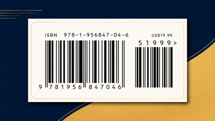
The ISBN is your book’s identity — and whoever owns it controls your listing. Here is why owning…
Read article
Hybrid and vanity presses often keep a share of your royalties for life. Here is how flat-fee publishing…
Read articleThis site is protected by reCAPTCHA and the Google Privacy Policy and Terms of Service apply.
Comments
Join the conversation — we read every comment.